6 things to consider when revamping your office

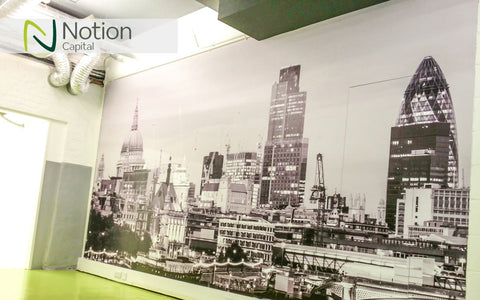
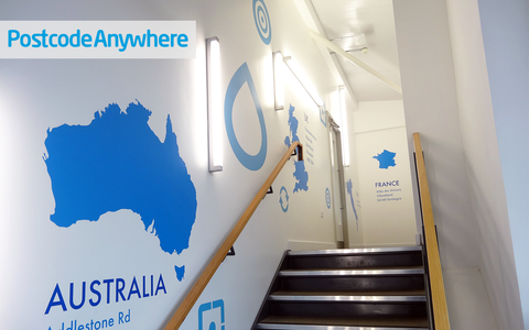
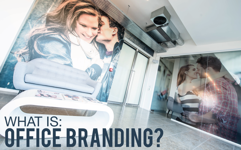
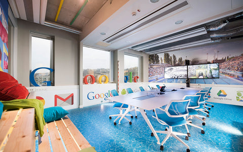
So you’ve decided to give your office space a nice lift? Interior graphics are the perfect way to bring life to bare walls. To make sure you get it right, here are six important things that will guarantee success.
1. Define the purpose
What are you specifically looking to achieve and who are you trying to communicate with? Unlike domestic interior design, the finished look is very rarely the only desired outcome of a workplace branding project. You need to ask yourself:
- Is the design purposed for staff areas?
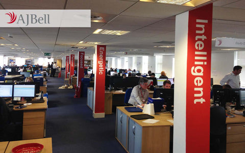
- Does it need to highlight culture and values?
- Will the design be client facing and need to showcase the brand’s offering?
By doing this, you’re taking a step back and asking “Why”, before “What”. This is crucial. This gives you a holistic understanding of the project and will guide you in the styling of what wall and window graphics to use and where to put these design elements.

2. Create space definition
All offices, including open plan workspaces, have different areas and zones within them, which are important to highlight. These spaces can be defined by their physical walls, their purpose or by how they are organically used; spaces aren’t always used for their established purpose.
It is fundamental to analyse how these different areas of the office are used, so that you can establish individual sub-spaces that may have differing requirements you will need to address.
However this is not to say that they should be branded as individual units, as all design needs to be considered as a whole entity.
3. Find your viewpoints
In most office spaces you will be able to see several key surfaces that you have highlighted for branding from one viewpoint. Stand in these positions. Picture how the room will look with wall art.
These viewpoints are often doorways or entrance spaces, but can also be the middle of an open plan office, so it’s important to physically wander around in order to locate your viewpoints.
NB. Consistency in design is not limited to matching exactly, but allows for elements of its look and feel to be extracted to create a complimentary feature that works both alone and alongside its pair.
4. Understand white space balance

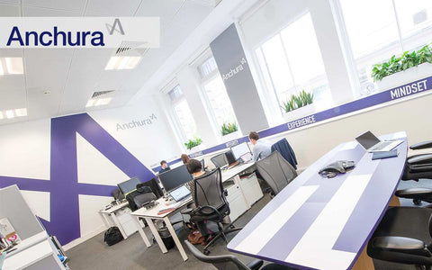
Don’t use every available space. The use of white, blank, negative or void space is essential to showcase the graphics to full effect. Put simply, blank space is your friend!
Overcrowding specific areas can reduce the impact of a design and can give a look and feel that is messy, cheap or sensually overpowering; undermining the aims of the rebrand itself.
However, this general design principle is dependent on the desired outcomes and can be ‘broken’ to create specific effects.
5. Find your Inconspicuous features
Understand the whole picture. As part of any office rebrand there can be several features of the office that won’t change, which if ignored could negatively impact the finished look and feel of the space.
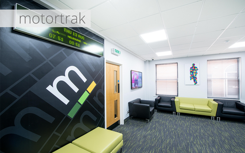
The most commonly overlooked feature is flooring, specifically carpet, which can come in almost every colour and texture under the sun, which understandably could clash with your choice of architectural graphics.
As a result we always recommend you take a literal step back and view the space from a distance, taking into consideration all fixtures and fittings that aren’t changing and factor them into your design brief before making any decisions.
6. Consider different textures

The use of texture in interior design defines the look of a space and can be utilised to:
- Create balance
- Provide visual weight
- Project a perceived sense of touch
- Portray specific attributes (i.e. quality)
Vinyl wall graphics and wallpapers are available in an almost endless variety of textures that can be used to create a number of finishes within your workspace.
Vi Tip: The use of matt vinyl for interior surfaces is highly effective due to how it interacts with the bright lighting of commercial offices and retail units.
Textured wallpapers on the other hand create a perceived sense of touch when viewed and as a result can project or alter an interpretation of a space, often softening the room’s feel. Texture has to be considered from a holistic standpoint, as it must be integrated with the rest of the design to facilitate the end result you are after.
If you would like some additional help with the best practise for graphics using interior design principles, or simply somebody to bounce ideas off, contact a member of our team.
Sources:
Image 1:
https://www.behance.net/gallery/24893463/Cision
Image 2:
https://www.behance.net/gallery/10621149/UDI-Office-Intuitive-Wayfinding
Image 5:
https://www.behance.net/gallery/19128081/NETWORK-18-OFFICE-DESIGN-CONCEPTpresentation-slide


